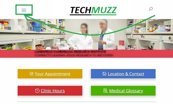
This article will help you to move the mobile menu to the left of the logo in Divi theme. The steps mentioned here are very simple to implement even if you have custom or different setup.
Please make sure that you observe the setup difference if there is any. Because if you are reading this article in future and Divi theme developer start using a different structure, then you might need to do the step little differently.
Let’s get to the real stuff, Shall we?
Step 1: First thing first open your header.php file and find this line. The important part is that any div with class et_menu_container is what we want because this class contains the whole menu objects.
<div class=”container clearfix et_menu_container”>
Step 2: Then paste below code as the first thing of the div. This way when you squeeze the page the hamburger menu will be rendered on the left side of the logo.
<?php
do_action( ‘et_header_top’ );
?>
Step 3: Find the similar code somewhere near the end of et_menu_container div in the same file and remove it or else you would have 2 identical mobile menusin your page.
Step 4: Divi theme uses jQuery to populate elements in the mobile menu. So we will have to update the function call into custom.js file. Make a mental note here that the Divi Theme actually uses custom.js.min file instead of custom.js file to make your site faster while it loads but it considered good practice to have both minified and non-minified file in sync with all updates.
So Find something like this into your javascript files.
et_duplicate_menu( $(‘#et-top-navigation ul.nav’), $(‘#et-top-navigation .mobile_nav’), ‘mobile_menu’, ‘et_mobile_menu’ );
And then replace it with this line.
et_duplicate_menu( $(‘.et_menu_container ul.nav’), $(‘#et_mobile_nav_menu .mobile_nav’), ‘mobile_menu’, ‘et_mobile_menu’ );
If you want to know what we did above, we just changed the source and target in the function call so that it will populate the menu that we want and created in the above steps instead of the default one that we removed in Step 3. This step is important because without this the mobile menu won’t have anything to show.
Step 5: That’s it
You might need to add some custom CSS so that this change looks better for your setup. As we have mentioned above please make sure you just don’t exactly copy and paste the code that we have mentioned because this might change in future if Divi theme developer uses a different name for classes fordiv containers then you would have to do such alteration to above code snippets.
But if you need any help don’t think twice just share your query in the comment section below. We will be glad to help you and this could help others too.
real very good
real very good
nice work !!!!!!
real very good